Symmetry
Bi-lateral symmetry
vertical / horizontal axis


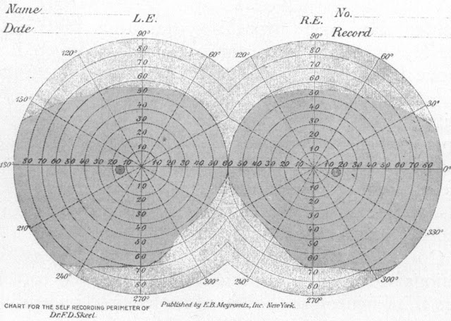
Bilateral Symmetry - horizontal axis
B
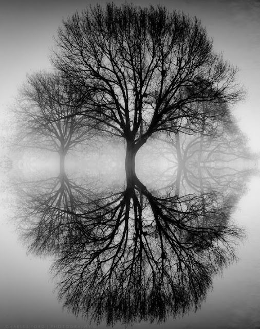
Bilateral Symmetry - vertical axis
Radial symmetry - elements that are arranged around a central point
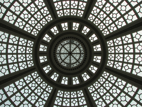
Domed Ocular (window) in architecture
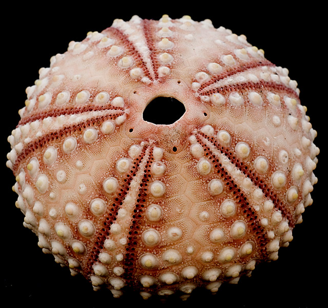
a sea urchin
 Op-Art
Such a strong contrast between black and white our eyes are unable to focus and thus optically look as if the drawing is moving
Op-Art
Such a strong contrast between black and white our eyes are unable to focus and thus optically look as if the drawing is moving

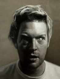
Emphasis through strong light source = Chiaroscuro
Emphasis is the part of the design that catches the viewer’s attention. It is the focal point. Usually, the maker will make one area stand out by contrasting it with other areas. The area could be different in size, color, texture, shape, etc.
Movement is the path the viewer’s eye takes through the work of art, often to focal areas. Such movement can be directed along lines, edges, shape, and color within the work of art or design. Horizontal = passive Vertical = active Diagonal = emphasis speed

Christo - Running Fence 1976

Christo Running Fence Concept drawing
Pattern is the repeating of an object or symbol all over the work of art.

M.C. Escher - tessellation wood block print
Repetition works with pattern to make the work of art seem active. The repetition of elements of design creates unity within the work of art.

M.C. Escher - tessellation woodblock print
Proportion is the feeling of unity created when all parts (sizes, amounts, or number) relate well with each other. When drawing the human, the proportion can refer to the size of the head compared to the rest of the body.

Symmetry
Bi-lateral symmetry
vertical / horizontal axis


 |
| Bilateral Symmetry - horizontal axis |
 |
| B |
Bilateral Symmetry - vertical axis
Radial symmetry - elements that are arranged around a central point
 |
| Domed Ocular (window) in architecture |
 |
| a sea urchin |

Op-Art
Such a strong contrast between black and white our eyes are unable to focus and thus optically look as if the drawing is moving

 |
| Emphasis through strong light source = Chiaroscuro |
Emphasis is the part of the design that catches the viewer’s attention. It is the focal point. Usually, the maker will make one area stand out by contrasting it with other areas. The area could be different in size, color, texture, shape, etc.
Movement is the path the viewer’s eye takes through the work of art, often to focal areas. Such movement can be directed along lines, edges, shape, and color within the work of art or design. Horizontal = passive Vertical = active Diagonal = emphasis speed
 |
| Christo - Running Fence 1976 |
 |
| Christo Running Fence Concept drawing |
Pattern is the repeating of an object or symbol all over the work of art.
Repetition works with pattern to make the work of art seem active. The repetition of elements of design creates unity within the work of art.
 |
| M.C. Escher - tessellation wood block print |
 |
| M.C. Escher - tessellation woodblock print |

 |
| René Magritte, The Listening Room, 1957 Surrealism |
Rhythm is created when one or more elements of design are used repeatedly (repetition) to create a feeling of organized movement. Rhythm creates a mood like music or dancing. To keep rhythm exciting and active, variety is essential.

 Jackson Pollock - Autumn Rhythm

France's Pech Merle cave of spotted horses and human hands - 25,000 BCE
Variety is the use of several elements of design to hold the viewer’s attention and to guide the viewer’s eye through and around the work of art. Variety offers difference in a creative work.

Unity is the feeling of harmony between all parts of the work of art, which creates a sense of completeness.
REPETITION
Repetition with variation is interesting, without variation repetition can become monotonous.
Without variety, five squares, all the same, can be taken in quickly and understood with a single glance.
When variation is introduced, the five squares, although similar, are much more interesting to look at and slow the viewer's attention down. The squares can no longer be absorbed accurately in a single glance. Each individual character, or the variation of each square, needs to be thoughtfully considered.
If you wish to create interest, any repeating element should include a degree of variation.
CONTRAST
Contrast is the juxtaposition of opposing elements, i.e. opposite colors on the color wheel - red / green, blue / orange etc. Contrast in tone or value - light / dark.
Contrast in direction - horizontal / vertical.
Too much contrast scattered throughout a painting can affect unity, making the painting to not have one focal point, but rather, many.


HARMONY
Harmony found in drawings are the visually satisfying effect of combining similar, related elements. i.e. analogous/adjacent colors on the color wheel, similar shapes, etc.

DOMINANCE
Dominance gives a drawing interest, counteracting confusion and monotony. Dominance can be applied to one or more of the elements to give emphasis.

UNITY
Relating the design elements to the idea being expressed in a work of art reinforces the principle of unity. Example, a drawing with an active aggressive subject would work better with a dominant oblique direction, course, rough texture, angular lines. In contrast, a quiet, passive subject would benefit from horizontal lines, soft textures and less tonal contrast.


Jackson Pollock - Autumn Rhythm

France's Pech Merle cave of spotted horses and human hands - 25,000 BCE
Variety is the use of several elements of design to hold the viewer’s attention and to guide the viewer’s eye through and around the work of art. Variety offers difference in a creative work.

Unity is the feeling of harmony between all parts of the work of art, which creates a sense of completeness.
REPETITION
Repetition with variation is interesting, without variation repetition can become monotonous.
Without variety, five squares, all the same, can be taken in quickly and understood with a single glance.
When variation is introduced, the five squares, although similar, are much more interesting to look at and slow the viewer's attention down. The squares can no longer be absorbed accurately in a single glance. Each individual character, or the variation of each square, needs to be thoughtfully considered.
If you wish to create interest, any repeating element should include a degree of variation.
CONTRAST
Contrast is the juxtaposition of opposing elements, i.e. opposite colors on the color wheel - red / green, blue / orange etc. Contrast in tone or value - light / dark.
Contrast in direction - horizontal / vertical.
Too much contrast scattered throughout a painting can affect unity, making the painting to not have one focal point, but rather, many.


HARMONY
Harmony found in drawings are the visually satisfying effect of combining similar, related elements. i.e. analogous/adjacent colors on the color wheel, similar shapes, etc.

DOMINANCE
Dominance gives a drawing interest, counteracting confusion and monotony. Dominance can be applied to one or more of the elements to give emphasis.

UNITY
Relating the design elements to the idea being expressed in a work of art reinforces the principle of unity. Example, a drawing with an active aggressive subject would work better with a dominant oblique direction, course, rough texture, angular lines. In contrast, a quiet, passive subject would benefit from horizontal lines, soft textures and less tonal contrast.